ITSM 2019.2 Release Notes
ITSM 2019.2 is finally here and it will have some major changes in forms you are using every day. We have made changes to both the support call find form and the support call detail form to facilitate our customers needs. Also, as to be expected from us, we have added new features to various modules in ITSM as well. In this release documentation you will get a better picture of the large amount of new features the new forms hold.
The Support Call Find Form
In the ITSM 2019.2 version you will be able to get a preview of the new find and detail forms which we intent to roll out in Clientele in future releases. In this release you will get a new find and detail form for the support call module.
Introduction video to the find form
Info
Any criteria filter used in the old find forms will not be available in the find form, this will have to be recreated by the user manually.
The new find form, as displayed below, has 4 different sections.
-
Find criteria section,
-
Find results,
-
Details of the highlighted record,
-
Additional information regarding the highlighted record.
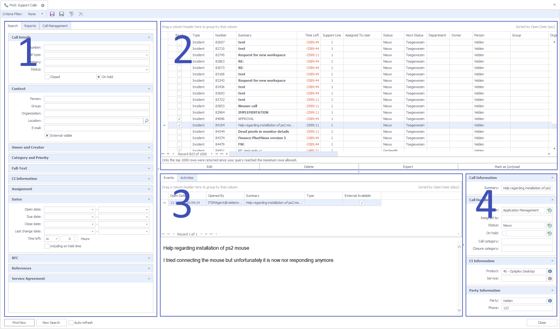
Find criteria section
The find criteria section is divided into groups and tabs. On the first tab, the search tab, the following groups are displayed.
- Call Details
- Context
- Assignment
- Owner and Creator
- Category and Priority
- Full-Text
- CI Information
- Service Agreement
- Dates
- RFC
- References
- Attributes
The user will be able to drag and drop the groups to change the order they appear in. Both the order and the state of the groupbox (collapsed or not) will be stored as your personal preference.
Notice that we combined the "My Support Calls" and "Support Calls in Queues" in the group called "Assignment". Using this group you will be able to easily select all your queues or all calls assigned to you making the "My Support Calls" and "Support Call in Queues" obsolete.
The second tab contains reports the user is able to run against any search results being displayed in the search grid. The Call Management is located on the third tab where users will be able to update a number of calls at the same time with the values provided in this section.
Info
A user will always be able to return to the default layout by right clicking a group and selecting "Restore Default Layout"
Find result grid
Sorting
Left clicking on any column will allow the user to set the sorting for that column. If you want to add another column to sort on, the user can right click that column and set sorting (ascending or descending) to include that column for sorting as well. To clear all sorting the user can right click and select clear sorting from the menu. It will restore the sorting to the original first column the user was sorting on.
Groups and columns
Introduction video to grouping and sorting
In the grid you will be able to group by columns by dragging a column in the bar that actually mentions "Drag a header here to group by that column". You are allowed to create a subgroup by dragging another group to the group already added. If you do not want a subgroup but rather an additional criterion in that group you can hold the control button while dragging this way it will combine the two groups.
When you right click anywhere in the "group by" box you get the option to fully expand or collapse all the groups, clear the grouping hide the "group by" box completely and you can toggle if you want to collapse all groups or not by default.
Right clicking the group will show additional options you will be able to perform(see example below). Right clicking on any column will also display a menu very similar to the one shown below. Some options might be missing like the group summary editor.
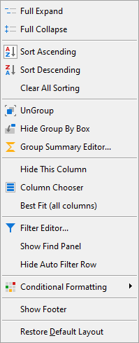
You will be able to fully expand or collapse the group(s) you have created. You can change the sort order or clear any sorting already applied to the header groups. Ungrouping and hiding specific groups is also an option.
With the group editor you will have the options to automatically count the number of records within the group or see for instance the maximum or minimum value.
As a user you will be able to decide which columns are displayed (from a predefined list) within the grid and automatically apply an automatically calculated width to the columns.
Filtering rows
There are different options when it comes to filtering the search results.
Introduction video to filtering
You will be able to use the Filter Editor, add a Find Panel, apply column filters to values of columns you used in a grouping or use the Auto Filter Row option. These options are listed in the same menu discussed earlier and can be accessed by clicking with the right mouse button on a column or by clicking the filter button when you added a column to group on.
Info
Please keep into account that all filtering is done on the rows displayed in the grid, it does not apply the filters on all data present in the database.
Filter Editor
The Filter Editor dialog allows you to build complex filtering criteria, combined from multiple expressions. To invoke this dialog you have to right-click a column header and select "Filter Editor".
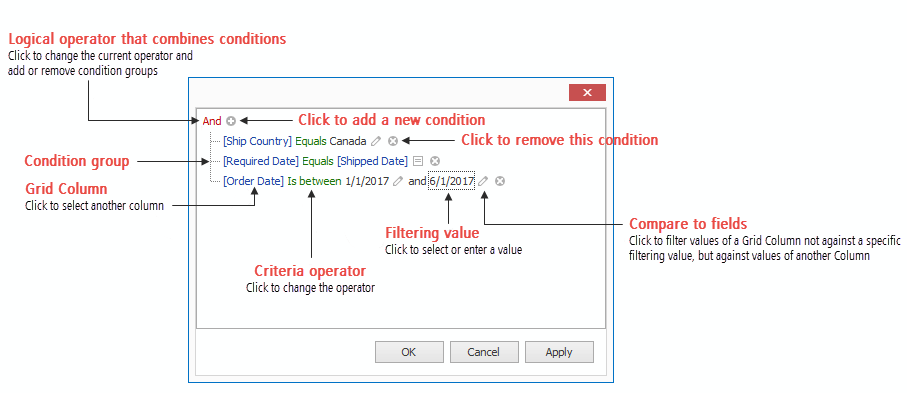
The Find Panel
This allows you to apply a temporary filter that filters data across all Data Grid columns at once. To invoke this panel, press "Ctrl+F" at runtime. Type in text you need to search for, then press "Find". Words corresponding to your search criteria will be highlighted in the returned rows.
Column Filters
By pressing the filter button in a (grouped) column you will have the option to either filter the column by selecting the value in a list in the Values section or by selecting the second tab which will either state Text Filters, Numeric Filters, or Date Filters. The 2nd tab will change depending on the type of column you are trying to filter on.
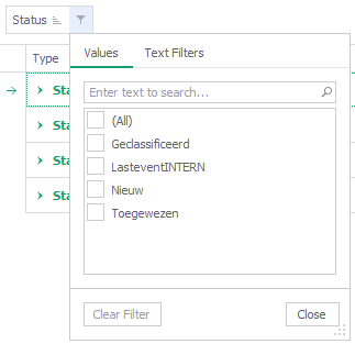
The 2nd tab filters will allow the user to create more advanced filters for the related column. The options available for the user are as follows;
Text Filters
- Equals
- Does Not Equal
- Begins With
- Ends With
- Contains
- Does Not Contain
- Is Blank
- Is Not Blank
Numeric Filters
- Equals
- Does Not Equal
- Is Null
- Is Not Null
- Between
- Greater Than
- Greater Than Or Equal To
- Less Than
- Less Than Or Equal To
- Top N
- Bottom N
- Above Average
- Below Average
- Custom Filter
Date Filters
- Is Same Day
- Equals
- Does Not Equal
- Is Null
- Is Not Null
- Between
- Before
- After
- Yesterday
- Today
- Tomorrow
- Last Week
- This Week
- Next Week
- Last Month
- This Month
- Next Month
- Last Year
- This Year
- Next Year
- Year To Date
- All Dates In The Period
- Custom Filter
Auto Filter
The automatic filtering row allows data to be filtered on the fly by typing text into that row. When you type text into this filtering row, a filter condition is automatically created based on the entered value and then applied to the focused column. The automatic filtering row is displayed at the top of the Grid View.

By pressing the icon ![]() additional operators are displayed for filtering.
additional operators are displayed for filtering.
Conditional Formatting
Introduction video to conditional formatting
You can highlight certain column cells that meet a specific condition using the Conditional Formatting menu. To invoke this menu, right-click the column to which a formatting rule should be applied and select Conditional Formatting.
Available format rules are displayed when expanding the Conditional Formatting menu. Different options are supported for different columns (depending on the type of data a clicked column displays).
Highlighting Cells that Meet a Specific Condition
You can use one of the predefined conditions (the Greater Than..., Less Than.., Between... and Equal To... menu items), provide a custom condition (the Custom Condition.. item) or format cells that contain the specified text (Text that Contains...) or refer to a certain date interval(s) (A Date Occurring...). Based on the selected condition type, an appropriate dialog window is invoked. You need to either enter a constant to be compared with the column's values, or select desired check boxes related to dates, or construct a custom condition in the dedicated editor. After that, choose a format style in the dropdown list, and click the OK button. To apply formatting to an entire row instead of a single cell, select the corresponding check box.
Highlighting Top or Bottom Cell Values
By selecting this you will be able to highlight cells that contain the highest or lowest values (the Top 10%..., Bottom 10%..., Top 10 Items... and Bottom 10 Items... menu items), and values that are above or below the column's average (Above Average and Below Average). Please be aware that this option is only available to integer columns.
Highlighting Unique or Duplicate Cell Values
In the dialog window, choose a format style in the dropdown list, and click the OK button. To apply formatting to an entire row instead of a single cell, select the corresponding check box.
Highlighting Cells Using Data Bars
A data bar fills a cell according to the ratio of the cell's value to the highest and smallest column values. A longer bar corresponds to a higher value, and a shorter bar corresponds to a lower value. Please be aware that this option is only available to integer columns.
Applying Color Scales
This format shows data distribution and variation using color scales. A cell is filled with the background color that is calculated according to the ratio of the cell's value to the highest and smallest column values. A two-color scale specifies two colors, which represent the minimum and maximum column values. Cell values residing between the minimum and maximum values are painted using a shade of these colors. A three-color scale additionally defines a color for the middle value and so, uses a gradation of three colors. Please be aware that this option is only available to integer columns.
Highlighting Cells Using Predefined Icons
Icon sets allow you to classify column values into several ranges separated by threshold values, and display a specific icon in a column cell according to the range to which this cell value belongs. In the Positive/Negative group, the available icon sets divide column values into three ranges: positive values, negative values and values equal to zero.
Other icon sets divide column values into three, four or five ranges, displaying a specific icon for each range. If an icon set contains three icons, the ranges are as follows: [0%-33%), [33%-67%) and [67%-100%], where 0% corresponds to the smallest column value and 100% corresponds to the largest column value. The icon sets with four icons classify column values into four ranges: [0%-25%), [25%-50%), [50%-75%) and [75%-100%]. For the icon sets that contain five icons,the target ranges are: [0%-20%), [20%-40%), [40%-60%), [60%-80%) and [80%-100%]. Please be aware that this option is only available to integer columns.
Manage Rules
Using this option will allow you to create new rules and edit or delete existing rules.
Show Footer
The show footer option will add a footer section where you will be able to add the sum, minimum, maximum, count and or the average of the selected column.
The Support Call Detail Form
The Support Call Detail Form is the other form that got a huge update.
Introduction video to the detail form
As displayed below, you will notice that we reduced the number of tabs displayed.
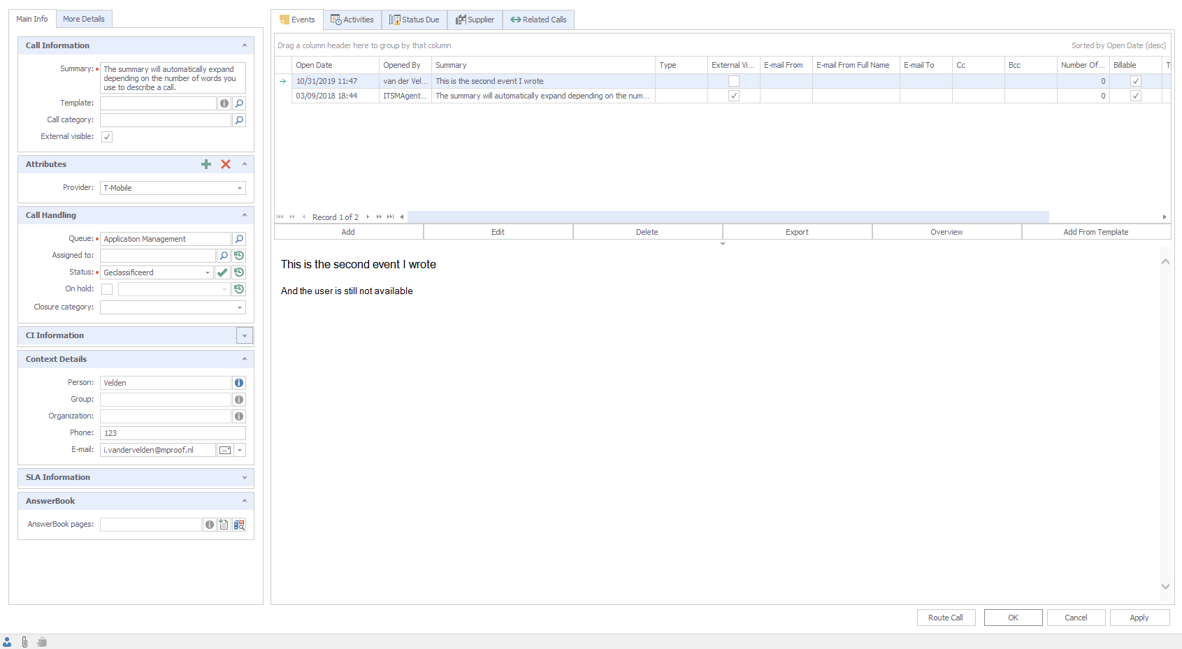 The biggest changes are listed below
- Applying a support call template will no longer save the call automatically. The call will wait for you to confirm by pressing apply or ok.
- We combined the two tabs for rfc information and approvals into a new tab called change.
- Attributes are now a group in the main info tab and user will be able to directly edit the attributes listed in that section.
- You will be able to hide the tab called "attributes" depending on the module option setting called HideAttributesTabPage.
- Groups can be changed in order and will be saved when the user saves the call.
- The related calls are split into two grids so you will see in one glance if the call has child or parent calls.
toggling Horizontal and vertical preview
The user has the complete freedom to decide if he wants the preview pane to be displayed horizontally or vertically. This can be done in both the find and detail form by opening the context menu by right clicking and toggling the command at the bottom saying Horizontal preview pane.
Customer requests
Primary phone number
This field will no longer be required.
New tags
Four new tags were added to support the Support Call Notification process. With these tags you will be able to add attachments which are related to the support call you are notifying on. These tags are;
- [FIRSTEVENTATTACHMENTSEXT]
- [FIRSTEVENTATTACHMENTSINT]
- [LASTEVENTATTACHMENTSEXT]
- [LASTEVENTATTACHMENTSINT]
New import managers
We added an import which allows material to be imported within activities, this import manager is called the FollowUpItemImportManager. The importmanager called ProductUsageImportManager will allow you to add product usage by party.
Find Criteria
We added the ability to use summary as a search criteria in the Service Agreement Find form.
Columns in find results
In Service Agreement detail form, in the product tab you will now see the location of the product listed as well.
Support Call Escalation
An option is added which allows the escalation task to skip Support Calls which are on hold.
Attachment summary
Now when dragging and dropping the summary will be automatically added as well. Also, as a user you will now be able to edit the summary of an existing attachment.
Audit Log configuration
We added functionality so a user can activate and deactivate events from the audit log event detail form. Previously you had to open every event, toggle the active button and save your changes.
Queue tab in application user
A queues tab has been added in the application user detail form which will allow the user to see to which queues that specific user is assigned to. You will also be able to quickly add and remove queue assignments.
Fixes
- The e-mail body of the support call escalation had some layout issues.
- The opportunity preview form had issues when trying to alter column options.
- The reminder time did not get updated when you moved an appointment to a later moment.
- Help files for data limitations have been adjusted.
- Fixed the issue that an supportcalltemplate did not properly apply the external visible flag for event templates.
- The drop down ability had disappeared for the font selection in the RTF editor.
- Solved an issue where the font changed when sending an e-mail.
- Pressing escape on an answerbookpage and having limited VEDA rights could cause an issue that you were unable to get out of the detail form.
- Kanban board cards would not display the values of long queue names correctly.
- Fixed issue with exporting followuplist
- When the maxfindrows moduleoption setting was set to 0, a message was displayed which made no sense.